EmptyEasel.com is an online art magazine with practical advice, tips, and tutorials for creating and selling art. This is an article written by Dan from EmptyEasel.com
USING THE COLOUR WHEEL:
COLOUR THEORY TIPS FOR ARTISTS AND PAINTERS
USING THE COLOUR WHEEL:
COLOUR THEORY TIPS FOR ARTISTS AND PAINTERS
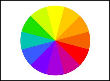
Colour Wheel
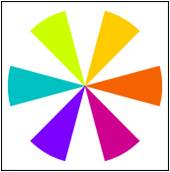
Understanding the color wheel and using color theory in your artwork is a good idea for any artist, and especially for oil painters. In this article I’ll go through the basics of color theory (using a traditional artist’s color wheel) and explain ways that oil painters and other artists can make use of that information.
In the color wheel pictured above, there are twelve colors. Although they might be self-explanatory, starting from the top and going around clockwise they are: Yellow, Yellow-orange, Orange, Red-orange, Red, Red-violet, Violet, Blue-violet, Blue, Blue-green, Green, and Yellow-green.
I’ll sometimes refer to a few of them by more common names, like Purple (for Blue-violet), Turquoise (Blue-green), or Magenta (which is pretty close to Red-violet). Other names like Light or Dark Orange, or even Chartreuse (for Yellow-green), are sometimes used by artists as well.
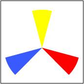
There are three Primary Colors which are the most important.
In the color wheel pictured above, there are twelve colors. Although they might be self-explanatory, starting from the top and going around clockwise they are: Yellow, Yellow-orange, Orange, Red-orange, Red, Red-violet, Violet, Blue-violet, Blue, Blue-green, Green, and Yellow-green.
I’ll sometimes refer to a few of them by more common names, like Purple (for Blue-violet), Turquoise (Blue-green), or Magenta (which is pretty close to Red-violet). Other names like Light or Dark Orange, or even Chartreuse (for Yellow-green), are sometimes used by artists as well.
There are three Primary Colors which are the most important.
Colour Wheel: Primary colours
These colors are of course Red, Blue, and Yellow. If you’re an oil painter, you can get any other color you need just by mixing red, blue, and yellow oil paint.
It’s not always easy, however, since no tube of paint contains purely one color. All of them have traces of other colors as well.
If you’re looking for more specific information on that, check out this article on mixing oil paints.
The primaries are the most powerful colors—in fact, blue and red are known specifically as power colors (think muscle cars), and yellow is the brightest color on the whole color wheel.
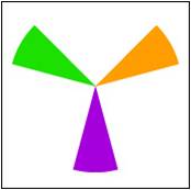
Mix any two of those primaries together and you’ll get one of these next three hues: the Secondary Colors.
It’s not always easy, however, since no tube of paint contains purely one color. All of them have traces of other colors as well.
If you’re looking for more specific information on that, check out this article on mixing oil paints.
The primaries are the most powerful colors—in fact, blue and red are known specifically as power colors (think muscle cars), and yellow is the brightest color on the whole color wheel.
Mix any two of those primaries together and you’ll get one of these next three hues: the Secondary Colors.
Colour Wheel: Complementary 1
Green, Orange, and Violet fall in between red, blue, and yellow, and each one is a Complementary Color to one of the primary colors.
It is important to know that scientifically there are more requirements for being complementary colors.
For our purposes, however, opposites on the color wheel works just fine. (You can read more about scientific color complements here at Wikipedia.)
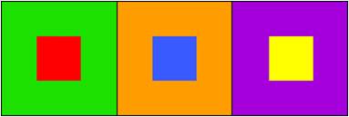
Complementary colors, when put together, appear more vivid then when apart.
Colour Wheel: Complementary 2
Green and Red, Blue and Orange, Yellow and Purple: each color is enhanced by the closeness of its “opposite.”
How does this apply to artists? Well, just because they’re called complementary doesn’t mean you should necessarily use them right next to each other at full strength. That can be rather garish.
However, if you DO want to add some extra punch to your color, including its complement somewhere in your artwork will help to draw emphasis to it. Also, some plein air painters will cover their canvas with red before painting a landscape so that the greens and blues they put on top if it will really jump out.
And as I just mentioned, colors like blue and green both will react similarly to red because in general they’re both opposite to it.
Of course, there are still other colors left in the wheel—the Tertiary Colors, commonly known as Intermediate Colors.
Colour Wheel: Tertiary
These six colors fill in the gaps between primary and secondary colors and are made by mixing one primary with one secondary.
As long as you’re painting from nature, most colors that you see won’t be primary or secondary; they’ll be some mix of softer color, like these intermediates.
The reason for that is because things like atmosphere (yes, air has a color!), distance, and lighting will blend with and change the colors of any object.
The same rules of complements do apply with these six colors as well, although the effect is usually less dramatic than with primary and secondary colors.
Now that we’ve filled out the color wheel, let’s look at some other groups of colors that affect art, starting with the Warm Colors
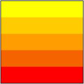
Colour Wheel: Warm colours
Warm Colors go from Yellow to Red on the color wheel, and will appear to visually come forward in artwork, towards the viewer.
No matter the innate color of an object, under bright light or heat (like the noonday sun) an entire scene can actually be colored completely by warm hues.
However, you’ll also want to look for Cool Colors.
Those often appear when a blue sky reflects cold light into the shadow areas that the sun can’t touch.
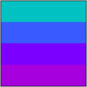
Colour Wheel: Cool colours
You’ll notice that I haven’t classified all of the colors as warm or cool—that’s because a few of them can go either way depending on what colors they’re placed next to.
Greens are often cool colors, but against a background of blues, they’ll come forward.
And Red-violet (or Magenta) can do the same thing, switching back and forth in different situations.
You can always use warm and cool colors to increase depth and space in your paintings. As light travels across a flat surface, it will often be brightest (and warmest) at one end, and fade to cooler hues in the distance.
If you’d like to know more about that, check out this article on temperature, value, and intensity in color.
And finally, with all twelve of the colors present, we can start picking out Analogous Colors (or Adjacent Colors).

Colour Wheel: Analogous colours
Like it sounds, these are three colors that go well together simply because they’re next to each other on the color wheel.
Sometimes they’re also referred to as Harmonious Colors, which makes sense because they’re almost like tones or steps of color, similar to musical notes in a single chord.
Designers and interior decorators use adjacent colors quite a bit; they’ll often combine them with one opposite, or complementary color, for a little punch of intensity.
Painters and artists can do the same. Popularity of certain colors comes and goes, but if you’re smart about it you’ll be able to paint in the same color schemes that people are currently looking for to decorate their homes.
So next time you start a painting, think about what colors will work best with your subject matter or potential buyers—because the proper use of color will always enhance your final artwork.
VALUE, INTENSITY AND TEMPERATURE
I’ve already written a few articles about color here at EmptyEasel, including one on how, and another on the amazing power of color in paintings.
Today I’ll be writing about how to SEE colors better, by looking specifically at three qualities every color has:
Value, Intensity and Temperature
Anybody can look at the ocean and say that it’s blue. But when asked to describe that blue, or the exact green of a pine tree, what would you say? If you’re an artist, of course, you might explain that the tree is a kind of brownish/green, or that the ocean on a cloudy day is more gray than blue.
Even then, it’s hard to narrow down colors exactly – and most of us aren’t naturally gifted that way either. But whether you’re gifted or not, by analyzing and learning to describe color, ANYONE can become a better painter.
Let’s start with value first. This strip of red has a full range of it.
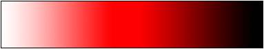
Colour Wheel: Shades
It goes from a light value on the left, to a dark value on the right. Most of us train our eyes to see value by drawing with pencil or charcoal. That’s great practice for painting as well.
In the following image, it’s obvious that the strawberries have quite a few values of red.
In the following image, it’s obvious that the strawberries have quite a few values of red.
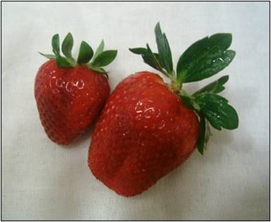
Colour Wheel: Strawberries
If I was painting them, I’d put down one brushstroke of color first, just to get some red down on the canvas. Then I’d look at the strawberry again and judge whether the next brushstroke (say, to the left of the one I already painted) should be a bit darker or a bit lighter.
Sometimes I think of painting as a constant adjustment of color. If you don’t get the value right the first time, that’s OK. By just having some paint down on your canvas in the first place you can compare it with what you see in real life (or your reference photo) and adjust it as necessary.
Intensity of color is the second quality to watch for. You can think of intensity as the overall purity or vividness of color. A muted, neutral color like a gray always has low intensity, while a bright orange has high intensity.
Colour Wheel: Intensity
When it comes to intensity in the photo above, the strawberries have quite a bit of it, even in their shadow sides. Although it’s a darker value (the color to the left), it’s still fairly vivid color.
As a general rule, objects that are farther away tend to be more neutral than objects close up.
That plays a subtle part even in these strawberries – the most vivid red is the closest red to us, on the bulge of the large strawberry.
After intensity, the third quality I look for when painting is temperature. And of course, that has to do with how cold or warm-looking a color is. Most colors tend to be one or the other: blue is cold and red is warm. But within the hues themselves there can be levels of coolness or warmth, and those are very important to be able to see when painting.
For instance, take another look at the cloth those strawberries are resting on. What color is it? How would you paint it?
Colour Wheel: Cloth 1
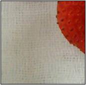
Colour Wheel: Cloth 2
Well, it’s really a white cloth, but because of the way white reflects light it has very obvious cold and warm areas. In the upper right, it’s a cold, vivid, light blue, and in the bottom left it turns into a neutral tan.
If I was painting this I’d start by mixing up some of that vivid blue, and then as I moved down and towards the left I’d neutralize, warm up, and very slightly darken my mixture of paint.
The temperature of an object is often in relation to how much light it’s receiving, and what kind of light it is (outside light, studio lights, etc.) Our eyes accept temperature shifts without thinking about them, but as artists we need to understand that they’re always there, and paint them in.
So in review, when painting, ask yourself these three questions:
1. Is the color I’m trying to match darker or lighter than the color I’ve mixed?
2. Is it more neutral, or more vivid than my color?
3. Is it colder or warmer?
If you keep those thoughts at the front of your mind while painting and adjust your paint mixture accordingly, the correct colors will soon follow.
